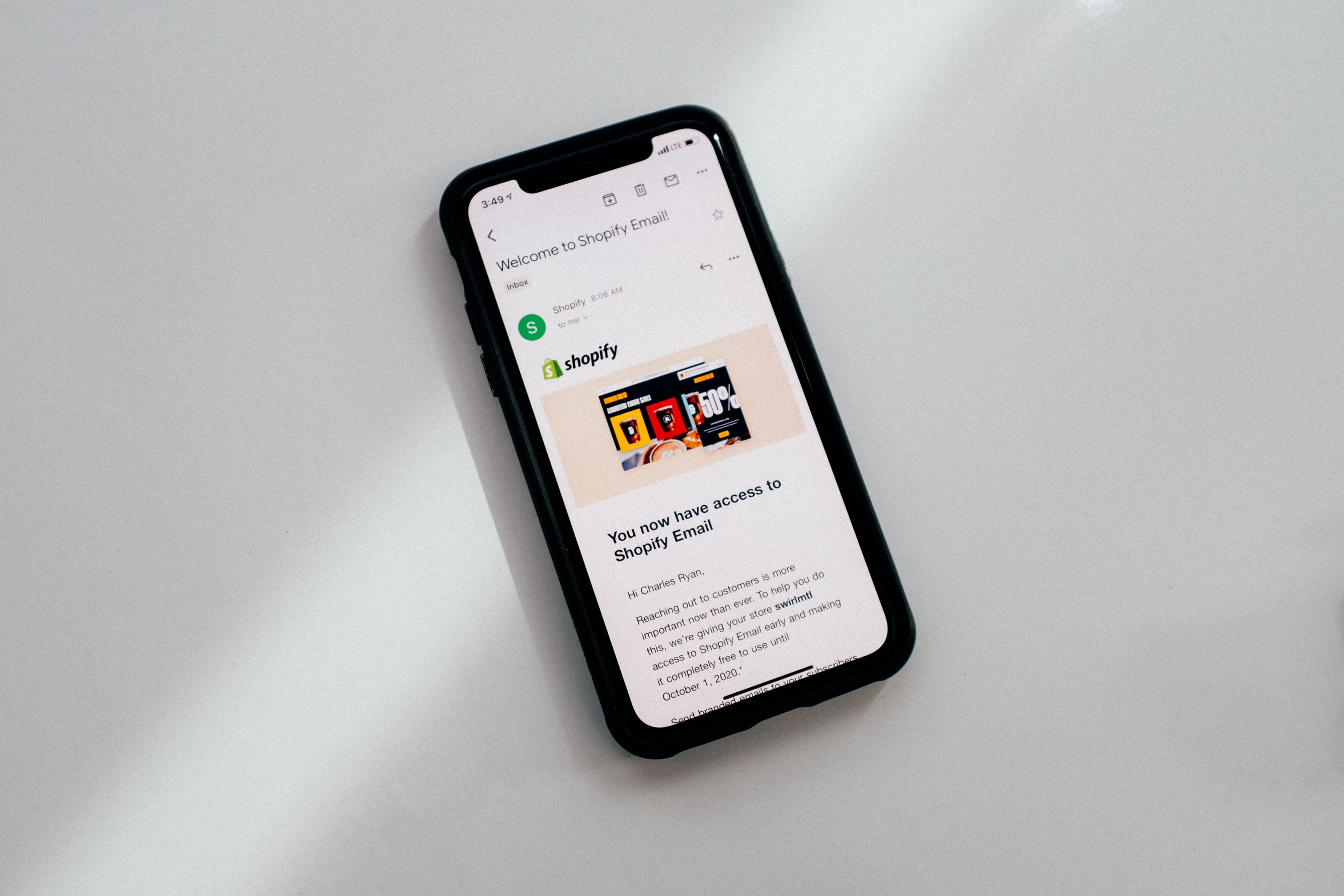
Mobile usage has lately soared over the world, fueled by lower-cost devices and higher mobile-network internet speeds. This means that an increasing number of individuals are accessing the internet using devices other than desktop PCs.
This indicates that an increasing number of potential consumers are visiting your Shopify store to make purchases using their mobile devices. Here’s a practical guide to optimise your Shopify website for mobile and avoid missing out on an increasingly mobile population.
1. Create a Responsive Website
The term “responsive web design” refers to how a website adjusts to different screen sizes. Instead of having a distinct mobile version of the site, the parts of a website will shift, shrink, and change to optimise for user experience dependent on screen size.
Fonts are often resized, photos and videos are shrunk, and many columns are stacked vertically to produce a seamless browsing experience. There is frequently no horizontal scrolling on these pages. Responsive design is also beneficial to SEO. According to Google, it is their recommended format for mobile web pages.
2. Make Your Navigation Easier
It’s tempting to provide your consumers with as many alternatives as possible so that they may choose from a wide range of items or services.
However, this might have the opposite consequence. Users may become disoriented by a plethora of options and suboptions and abandon your site. This raises the bounce rate and may cost you dearly in terms of SEO in the long run.
Our advice is to thoroughly analyse your navigation structure and categorise your pages according to their significance. Keep only what is necessary for your company and add it to the menu. Only allow one level of nested content. That benefits both search engine bots and your users.
3. Place Your Product Photos at the Forefront
The popularity of mobile applications such as Instagram and Snapchat demonstrates that mobile surfing is primarily a visual experience. While product descriptions and calls-to-action significantly influence the desktop buying experience, they have less of an impact on a mobile device. And, because online customers base their purchase decisions mainly on the visual aspect, product photography should be prominent on all pages of a mobile eCommerce design.
4. Reduce the Amount of Text on Your Mobile Page
While your desktop business may have just the right amount of white space, beautifully written product descriptions, and eye-catching language integrated with photographs, it may not necessarily convert to a compelling mobile experience.
There are a few crucial factors to consider when it comes to limiting content on your product pages. “Is the written material on this page vital for converting customers?” you can ask yourself. If it isn’t, get rid of it.
Reduce the length of your product descriptions to contain just the most essential information. This eliminates the need for your clients to scroll down your website. Finally, if the layout of your product page appears cluttered on your mobile shop, look for a more mobile-friendly Shopify theme that keeps critical material at the Forefront (such as your add-to-cart button) and organises the rest neatly below in a prioritised order.
5. Improve Site Speed By Compressing Media
When it comes to site loading time, you always want your site to be fast. However, on mobile, quickness is much more critical. That implies that another critical step toward making your website mobile friendly is to compress anything that takes up a lot of space and delays loading speed.
This most likely includes your high-resolution photos as well as your CSS. By compressing them, you can ensure that they load faster without compromising the quality of what visitors view on the site.
Conclusion
Even if you get everything perfect today, how mobile devices appear and operate will change over time, and today’s mobile-friendly website might not work tomorrow. Continue to test, adjust when necessary, and maintain your mobile users as a priority, and you should do just fine.
Are you looking for SEO-friendly web design in Perth for your growing business? The SEO Room is here to help. We provide holistic website design to help you boost audience engagement and communicate your advocacy. Please consult with us now!


